Exercise: Getting to know your brushes
The first part of this exercise was a bit like the initial mark making exercises in Drawing 1 the instructions were to explore the range of marks and shapes that can be made with your brushes. I used artist's acrylic colour for this exercise.
I started off by just choosing one colour at a time. On each sheet I tried various thicknesses of paint and applied it in different ways from dabbing and stippling to dragging an almost dry brush across the paper. I created marks of varying thickness by using the side, tip and body of the brush.
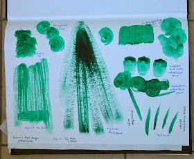
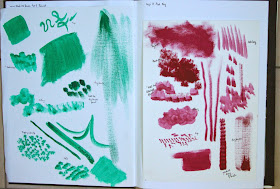
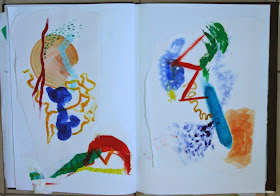
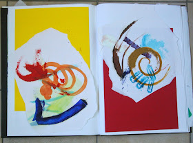
This was a useful introduction but I was aware that my monochrome results weren't particularly visually interesting and I didn't think I'd pushed this exercise very far. I remembered a mark-making exercise I'd seen in the book 'Drawing and Painting People - A Fresh Approach' by Emily Ball (Crowood Press 2013) so I though that would be good way to move forward. I used an A1 piece of cartridge paper and a range of water mixable oil colours and brushes (plus the occasional palette knife). The idea was to make six conversations each between six marks to fill the A1 sheet. The first mark is placed and then the next and each subsequent mark should in some way contradict the preceding mark. This exercise was more fun and made me think more clearly about each mark I was making. I have torn up the A1 sheet and mounted a few of the conversations in my sketchbook.
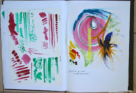
The red water mixable oil developed a strange grainy texture when mixed with a solvent which was supposed to be specifically for this type of paint. It created a better wash when diluted with water.
The next task was to paint a small and simple landscape from memory. This was not something I relished the idea of doing as the landscape section of drawing 1 was my weakest area and also drawings I created from memory always seemed to be weaker than those from observation as I tended to lapse back into old bad habits of making assumptions about the appearance of things. I decided to paint a view which I had previously drawn and one of my favourite local places(the Roman Bridge at Cerreto Sannita) because it is very familiar to me and I though I might have a clearer visual memory of it than many other places. The drawing of this place that I made previously had been too cluttered and busy and I thought that working from memory might serve to simplify it by helping me to pick out only the essentials.
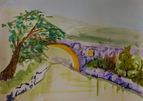
I used acrylic paint on acrylic prepared paper (A4). Before starting I had envisaged myself deftly mixing the precise colours, enjoying the texture of the paint and slapping it on boldly and with confidence. The reality was far from this fantasy! The greens were too lurid, the shadows were too purple and I really struggled handling the brushes to make any semblance of a landscape let alone considering creating variety and interest in mark making. I came to the conclusion that this is going to be very steep learning curve.
Undeterred I had another try but made my effort much simpler. At this time of year the vineyards all around us are ablaze with autumn colour which contrast dramatically with the almost acid green of the grass. This was my attempt at showing the essentials of this from memory.
I was happier with this second attempt although it took less time and effort than the first. I've made a variety of marks and used I variety of dilutions of the acrylic paint (getting more dilute in the distance). There is less detail but is still 'reads' as a landscape and it conveys the sense of distance and depth better than the first attempt.
I then had two attempts at painting a piece of fruit which was the next task in the exercise:
The orange was painted in acrylics on Bockingford watercolour paper. I randomly assigned it a blue background just because it was a complementary colour and would make the orange stand out. I used a large brush in fairly obvious strokes to create the form of the orange and then used the tip to create small marks to suggest the texture. I particularly like the marks on the blue background made by dragging an almost dry brush containing a lighter tone of the same colour over the darker base.
For the apple, I used much more dilute paint in the background and somewhat thicker but still quite liquid paint for the apple itself. I made a variety of marks by dabbing the tip or the side of the brush try to represent the patterning of colours on this dappled apple (a Braeburn or a Royal Gala type)
From these exercises I gained a bit of confidence in handling the brushes and paints. This is a first unsteady step in the right direction.


No comments:
Post a Comment