Introduction
I really enjoyed this research point although it was a very involved and extensive piece of work.
I have been interested in colour ever since I was a small child when I would obsessively arrange my felt tipped pens and coloured pencils into colour graduations. When I did 'O' level art at school, my mum lent me a book about colour which I pored over and in the process acquired a very rudimentary understanding of complementary colours. This resulted in multiple paintings of green and red peppers. At 'A' level back in the 1980s we painted colour wheels and did exercises about colour harmony but Chevreul's name was never mentioned. It never occurred to me to question where the information about contrasting colours and the colour wheel had come from. I just took it for granted that the rules I was given about complementary colours and their mutual enhancement when juxtaposed as well as the effect of mixing red and green in the shadows for my peppers were common sense and common knowledge . It wasn't until I visited an exhibition at the National Gallery in London last summer entitled 'Making Colour' that I first heard of Chevreul. The exhibition was mainly concerned with the production of pigments however one of Chevreul's colour wheels was exhibited in the first room of the exhibition. In the gallery bookshop after the exhibition I coveted a copy of John Gage's 'Colour and Meaning: Art, Science and Symbolism' Thames and Hudson 1999 (reprinted 2013) but couldn't justify the expense of buying it. This research point gave me the perfect excuse and I have enjoyed reading this text which approaches colour in the context of art history looking at the very complex world of colour research and theories including physics, physiology, psychology, neurology and philosophy. I will confine my discussion here to Chevreul and much of the information here will have come from this text but also from a more succinct summary of Chevreul's work which I found on the Internet 'Chevreul's Colour Theory and its Consequences for Artists' by Georges Roque Click here to link to the paper published by the Colour Group (Great Britain). I will write a subsequent essay highlighting some of the other areas of colour research which I found interesting.
Chevreul's Life and Work
Michel-Eugene Chevreul (1786-1889) was a chemist and a very successful one. His interest in colour arose because he was employed by Gobelin's manufacture in France. In 1824 he was made their director of dyeing (1),(2). His task was to oversee the dyeing of wool and silk for the manufacture of furniture, carpets and tapestries. His interest in the interaction of colours was stimulated by his observation of unforeseen effects of one colour of thread on the apparent colour of another - I will go into this in more detail later
In 1828 he published 'memoir on the influence that 2 colours can have on each other when seen simultaneously'(2) which introduced his theories of simultaneous and successive contrast. In 1839 he published a much more in depth book about this subject ' On the law of simultaneous contrast of colours and its applications to......' (many applications were listed including painting).
Chevreul continued to publish on this subject throughout is very long career (He worked until the age of 97). Other publications include 'Chromatic Circles' 1855, 'Outline of a way to name and define colours' (1861) and 'On colours and their applications to the Industrial Arts' (1864)(1)
Law of Simultaneous Contrast
'In the case where the eye sees at the same time two contiguous colours, they will appear as dissimilar as possible, both in their optical composition and in the strength of their colour' (1)
The development of this theory was stimulated by a perceived problem with the dyeing of black thread which was to be used in blue and violet fabrics. Weavers complained that the thread was not dyed adequately because it appeared dull. When Chevreul analysed samples of the wool he found that there was no problem with the dyeing. He therefore developed his theory that the wool appeared dull because of the the effect of the colours it was placed with. Hence the problem was not actually to do with chemistry which was his speciality but was about how the colours were being perceived, a potentially even more complex area involving physiology, neurology and psychology. (1)
He proposed that the brain has a tendency to exaggerate the differences between adjacent colours and also between adjacent areas of different tonal values. Hence a dark grey placed next to a light grey will appear darker especially along the border - where the light grey will appear lighter. A green placed next to a red will look greener and the red will look redder. He defined this as follows:
'If we look simultaneously upon two stripes of different tones of the same colour, or upon two stripes of the same tone of different colours placed side by side, if the stripes are not too wide, the eye perceives certain modifications which in the first instance influence the intensity of the colour, and in the second, the optical composition of the two juxtaposed colours respectively. Now as these modifications make the stripes appear different from what they really are, I give to them the name of simultaneous contrast of colours; and I call contrast of tone the modification in intensity of colour and contrast of colour that which affects the optical composition of each juxtaposed colour' (1)
Chevreul knew about complementary colours and the source of this knowledge was the work of Buffon. In particular his observation of 'accidental colours' which he published in 1743. Buffon had noted that when looking at a spot of a particular colour on a white background, a halo of the complementary colour would be be perceived around the spot. In addition, after staring at a spot of colour for example a spot of red on a white sheet and then staring at a blank white sheet then an image of a blue-green spot (the complementary of red) would be seen. (1)
Chevreul proposed that ' Two juxtaposed hues will be perceived as the most different as possible when the brain adds to the perceived hue a little of the complementary of the juxtaposed hue and vice versa' (1)
This seems to be analogous to the 'halo effect' observed by Buffon.
To make this clearer it could be illustrated by imagining a white pattern on a red background. Depending on the size of the white motif compared to the area that is coloured red, the white pattern may appear to be tinted green. This can be counteracted by adding a hint of red to the white. This is something which would have proved very useful to those in the business of producing textiles and wallpapers.
Chevreul also concluded that when two complementary colours are juxtaposed that mutual enhancement occurs.
Chevreul's law does depend on the size of the samples juxtaposed. Large samples of colour placed adjacent to each other obey the law of simultaneous contrast at their edges whereas small marks and threads become assimilated. This was a criticism aimed at Chevreul but Chevreul was aware of this and had not overlooked this phenomenon :
'There is a contrast of colour whenever differently coloured surfaces are properly arranged and susceptible to being seen simultaneously and perfectly distinct from each other" Whereas " There is a mixture of colours whenever materials of various colours are so divided and then combined that the eye cannot distinguish these materials from each other in which case the eye receives a single impression. ' (1)
The phenomenon described above Chevreul applied for example to the mixing of thread in tapestry. The application of Chevreul's law to different sized samples of colour was to cause subsequent confusion in the development of the theories in particular of the neo- impressionists and pointillists - this will be covered in greater detail in a later research point about optical effects.
Chevreul considered this mixing of colours by the eye to be a sort of subtractive mixture. We would today call this assimilation or optical mixture.
Chevreul's work was subsequently criticised because when he explained his observed phenomena there was confusion between additive and subtractive colour mixing (mixture of light versus mixture of pigments). This confusion about the physics of colour was widespread in Chevreul's time. (1)
Chevreul's Influence on Artists
Chevreul's theories were exerting an influence on artists even before his book was published because he gave a series of public lectures between 1830 and 1850.
Initially the most enthusiastic recipients of his work were people working in the applied or decorative arts rather than fine art painters. They found practical applications for his theories in the distribution of colour in many fields of endeavour.
Painters who did consult Chevreul initially included Louis Hersent a neo-classical painter and a professor ay L'Ecole des Beaux-Arts. He was also consulted by Louis Daguerre during the period in which he was painting dioramas.
Chevreul became good friends with the painter Horace Vernet. Vernet's specific area of interest was in the painting of battle scenes. However, none of the above named painters allowed Chevreul's theories to exert a major influence on their work. In fact Vernet was criticised for exhibiting poor colour harmony in his work. (2)
Chevreul's theories were primarily of interest to artists who wanted to apply science to achieving greater colour intensity in their works and were looking for simplified rules to follow. However, there is some confusion and in Chevreul's time there was widespread misunderstanding as to what Chevreul's intention was. It was taken as fact that Chevreul would have recommended painting the simultaneous contrast of colours. In fact he was more an advocate of "contrasts of analogous colours" that is colours that have similar lightness. He also advocated 'economy of means' and painting in flat tints with reference to oriental painting. This was an area of interest to neo-classicist and romantic painters in 19th century France. This can be seen in the following examples of paintings by Delacroix and Ingres.(2), (1)
.jpg) |
| Eugene Delacroix: Algerian Women in their Apartment Oil on canvas 1834 (picture source: wikipedia.org) |
 |
| Eugene Delacroix: Entry of Crusaders into Constantinople Oil on canvas 1840 (picture source: wikipedia) |
 |
| Jean Auguste Dominique Ingres: Odalisque with a Slave Oil on canvas 1842 (picture source wikipedia.org) |
In the painting by Ingres shown above, red and pale green are placed alongside each other to heighten the impact of the red. This suggests that Ingres may have been aware of Chevreul's work. However, I can't find any reference to Ingres and Chevreul ever meeting apart from Chevreul's comment to the painter Signac (when he visited him towards the end of his life) that he should consult Ingres who would tell him all he needed to know about his theories (unfortunately Ingres was already dead).
Delacroix, however, was known to have bought lecture notes from someone who attended one of Chevreul's lectures and he also had made an appointment to visit the chemist (but had to cancel owing to illness so never actually met him). So he was clearly interested in these theories. (1)
Impressionism
The impressionists would not have been too keen to admit to the influence of Chevreul on their work as their apparent aim was to paint exactly what they saw and depict the effects of light. However, Chevreul's work suggests that this is not actually possible because of the changes in perception of colours and tones when they are juxtaposed.
There is, however, some potential evidence of the influence of Chevreul on the painting of several impressionist painters. Look for example at Monet's poppy field of 1873. Click Here to view on the Musee D'Orsay Website . We can see a skillful use of red and green here. Monet himself said, " Primary colours look brightest when they are brought into contrast with their complementaries".
Pisarro was the first of the impressionists to put his paintings in white frames and also to tint his stretchers with the complementary colour of the dominant hue of the painting. This is clear evidence for the conscious application of Chevreul's theories. (1)
Neo Impressionists
These artists moved away from the impressionist ideal of looking directly at the effect of light in nature and became more concerned about the organisation of the pigments on the canvas. I will include more detail about the work in particular of Seurat and Signac in the research point later in this section about optical effects.
Signac visited Chevreul, and Seurat also said that the chemist was an influence in the development of his technique. Looking at the two paintings below there is evidence of attempts to apply Chevreul's theories in the development of the technique of pointillism.(1)
 |
| Paul Signac: The Breakfast. 1886-87 Oil on Canvas (Source: wikipedia.org) |
 |
| Georges Seurat: A Sunday afternoon on the Island of La Grande Jatte 1884-86 Oil on Canvas. (Source: wikipedia.org) |
Post Impressionists:
The Fauves
Perhaps unsurprisingly the next group of artists wanted to move away from the pointillist or divisionist style. They though that contrary to the stated aim of increasing vibrancy that the dotted application of the colour caused a reduction in the vibrancy of each adjacent colour (more on this later under 'optical effects'. The fauves, reacted against this and started painting in large areas of flat pure colour of contrasting hues.(4) Examples are shown below:
 |
| The Green Stripe - Portrait of Mme Matisse Henri Matisse. 1905. Oil on Canvas (Source: wikipedia.org) |
 |
| Estaque: Andre Derain. 1905. Oil on Canvas (Source: wikipedia.org) |
In both off the examples above it can be seen that there is little attempt to build form with light and shade. Instead, flat areas of bold colours are juxtaposed. Red and pink re contrasted with green in the Matisse portrait. In the Derain Landscape there are many examples of complementary colour contrasting with each other - in particularly red with green and orange with blue. Chevreul himself was an advocate of painting with flat as I have mentioned above. (2)
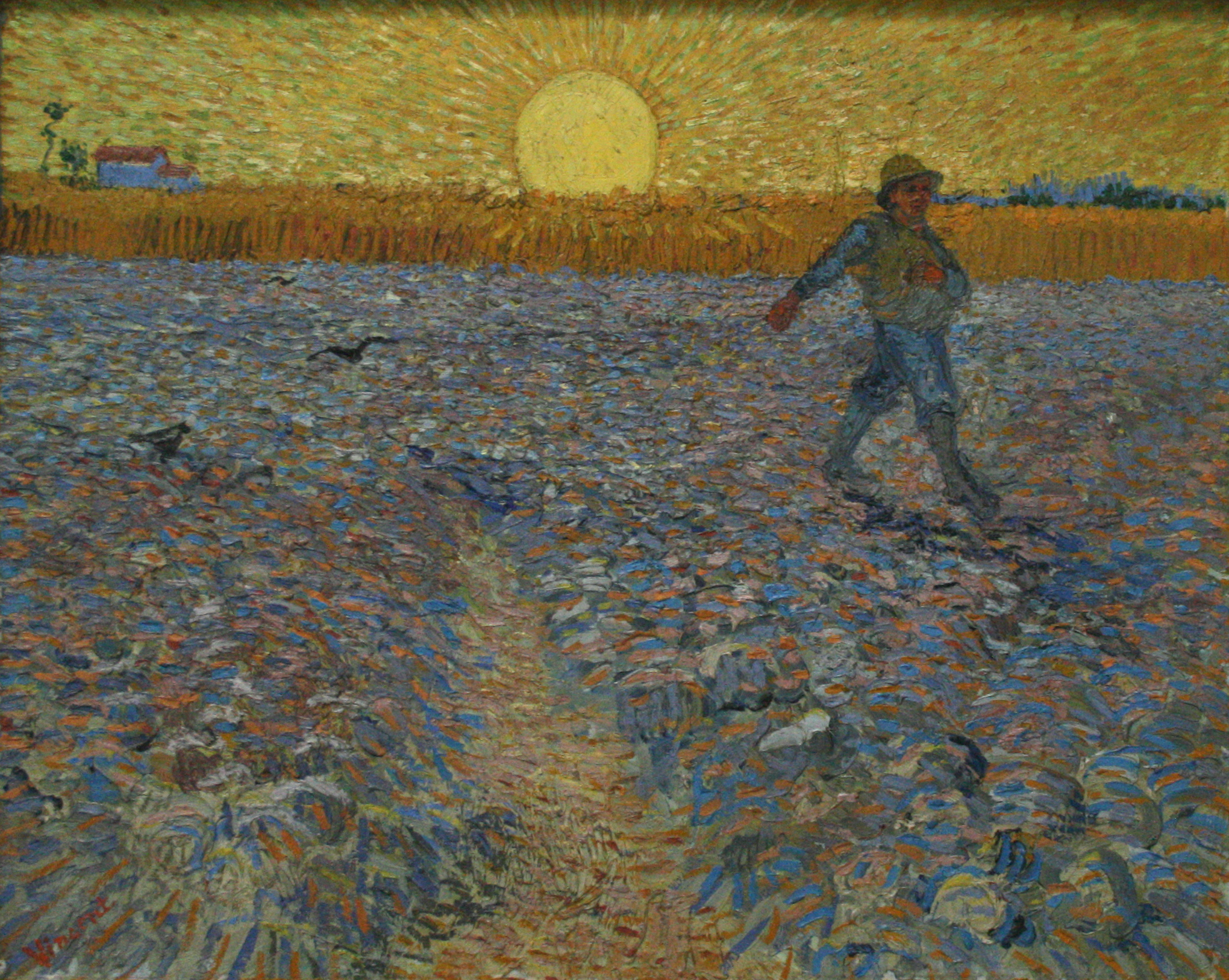
Van Gogh was also interested in the use of complementary colours, not only from the point of view of the visual impact and harmony of the colours but also in terms of their potential symbolism. He explained his aims in his letters to his brother Theo. He made studies of flowers:
"Seeking oppositions of blue with orange, red and green, yellow and violet. Seeking broken and neutral tones to harmonise brutal extremes. Trying to render intense colours and not a grey harmony" (1)
 |
| Vase with Pink Roses: Vincent Van Gogh. 1890. Oil on Canvas (Source: wikipedia.org) |
In the painting 'Vase with Pink Roses' there is a subtlety to the contrast of the touches of pink in the roses with the green of the leaves and the paler greens of the table and the background. In 'The Sower' there is a similar contrast of marks of orange and blue as is seen in Paul Signac's 'The Breakfast'. There is an aspect of pointillism to his technique but the marks made in laying down the colour are larger and bolder- (more clumsy but not in a bad way).
Van Gogh also wrote that in his 'The Bedroom' of 1888 (below) he thought that the combination of colours he used should provide a restful sensation for the viewer. He had carefully planned the positioning of the colours on the canvas. (1)
 |
| Vincent's Bedroom in Arles. Vincent Van Gogh. 1888 Oil on Canvas (Source: vangoghgallery.com) |
Abstract Artists
Robert Delaunay started to experiment with pure abstraction in 1912. He and his wife Sonia co-founded the movement which came to be known as Orphism. Before this, however, he and Jean Metzinger made a development from pointillism using larger mosaic-tile reminiscent marks of flat colour. They called this 'divisionism'
Click here for an example of divisionism 'La Dance (Bacchante) by Jean Metzinger - 1906 (from wikipedia.org)
Click here for an example of a divisionist Landscape by Robert Delaunay on wikigallery.org
From 1912 - 1914 came the development of 'Orphism'. Delaunay started to paint abstract work and was mainly concerned with the dynamic possibilities of bright colours - so the colours themselves would be the form of the painting. He found in the work of Chevreul, a set of rules he could apply to organising his colours and he freely admitted to the influence of,"The Brilliant Chevreul". (1)
Delaunay's state aim was to generate "colour movement'. He terrorised that complementary colours were harmonious and vibrated slowly when placed together whereas colours close to each other on the colour wheel would vibrate quickly. He thought that the arrangement of there vibrations on the canvas would give dynamism or colour movement. (1)
The disc paintings also show Chevreul's influence in that they are an investigation using areas of flat tints (4)
Link to Simultaneous Contrasts: Sun and Moon 1913 (moma.org) This painting also illustrates a similar dynamism through juxtaposition of colours.
Delaunay's theory of colour movement didn't come directly from Chevreul, but he did get influence from Chevreul's study of stained glass windows. The chemist said that they were a great example of simultaneous contrast because they offered well defined distinct sections with vivid colours which contrasted against each other and against the opaque leading between the panes.
Delaunay was inspired by both the transparency and the contrast and symmetry to paint a series of paintings based on windows. In these paintings there are angular areas or colour with both hard and soft edges - here the influence of cubism and Cezanne's painting technique can also be seen.
Link to Simultaneous Windows on the City. 1912 (wikipedia.org)
Several other artists were investigating these phenomena at the same time, Notably Fratišek Kupka and Sonia Delaunay. I will go inter greater detail about the work of Sonia Delaunay after I attend the Study visit to her retrospective exhibition an Tate Modern in April.
Link to Frantisek Kupka - Positioning of Mobile Graphic Elements. 1913 (wikiart.org)
Link to Sonia Delaunay - Electric Prisms. 1913 (wikiart.org)
The work of Chevreul has continued to influence artists either directly or indirectly until today. This as also partly due to the fact that his theories were heavily influential on two of the great teachers from the Bauhaus - Johannes Itten and Josef Albers. Both of these teachers wrote books on the subject of colour Josef Albers - Interaction of Colour and Johannes Itten - The Art of Colour. Both of these texts borrow heavily from Chevreul's work.(1) I will include more detail about this in the subsequent research point about optical effects.
References:
(1) 'Chevreul's Colour Theory and its Consequences for Artists' by Georges Roque. Based on a paper presented in Paris in June 2010 to the Colour Group (GB) meeting colour and textiles: From Past to Future. Published by The Colour Group (Great Britain) http://www.colour.org.uk 2011
(2) 'Chevreul between Classicism and Romanticism' (Chapter 15: pages 196-208) in 'Colour and Meaning- Art, Science and Symbolism' by John Gage. Thames and Hudson 1999 (Reprint 2013)
(3) 'The Technique of Seurat - A Reappraisal' (Chapter 16: Pages 209-218) in 'Colour and Meaning- Art, Science and Symbolism' by John Gage. Thames and Hudson 1999 (Reprint 2013)
(4) 'A Psychological Background for Early Modern Colour' (Chapter 20: Pages 249-260) in 'Colour and Meaning- Art, Science and Symbolism' by John Gage. Thames and Hudson 1999 (Reprint 2013)
From 1912 - 1914 came the development of 'Orphism'. Delaunay started to paint abstract work and was mainly concerned with the dynamic possibilities of bright colours - so the colours themselves would be the form of the painting. He found in the work of Chevreul, a set of rules he could apply to organising his colours and he freely admitted to the influence of,"The Brilliant Chevreul". (1)
Delaunay's state aim was to generate "colour movement'. He terrorised that complementary colours were harmonious and vibrated slowly when placed together whereas colours close to each other on the colour wheel would vibrate quickly. He thought that the arrangement of there vibrations on the canvas would give dynamism or colour movement. (1)
 |
| Disque Simultané. Robert Delaunay. 1912. Oil on Canvas. The inclusion of the word Sumultané in the title signals Delaunay's interest in Chevreul's theories (Source: wikipedia.org) |
Link to Simultaneous Contrasts: Sun and Moon 1913 (moma.org) This painting also illustrates a similar dynamism through juxtaposition of colours.
Delaunay's theory of colour movement didn't come directly from Chevreul, but he did get influence from Chevreul's study of stained glass windows. The chemist said that they were a great example of simultaneous contrast because they offered well defined distinct sections with vivid colours which contrasted against each other and against the opaque leading between the panes.
Delaunay was inspired by both the transparency and the contrast and symmetry to paint a series of paintings based on windows. In these paintings there are angular areas or colour with both hard and soft edges - here the influence of cubism and Cezanne's painting technique can also be seen.
Link to Simultaneous Windows on the City. 1912 (wikipedia.org)
Several other artists were investigating these phenomena at the same time, Notably Fratišek Kupka and Sonia Delaunay. I will go inter greater detail about the work of Sonia Delaunay after I attend the Study visit to her retrospective exhibition an Tate Modern in April.
Link to Frantisek Kupka - Positioning of Mobile Graphic Elements. 1913 (wikiart.org)
Link to Sonia Delaunay - Electric Prisms. 1913 (wikiart.org)
The work of Chevreul has continued to influence artists either directly or indirectly until today. This as also partly due to the fact that his theories were heavily influential on two of the great teachers from the Bauhaus - Johannes Itten and Josef Albers. Both of these teachers wrote books on the subject of colour Josef Albers - Interaction of Colour and Johannes Itten - The Art of Colour. Both of these texts borrow heavily from Chevreul's work.(1) I will include more detail about this in the subsequent research point about optical effects.
References:
(1) 'Chevreul's Colour Theory and its Consequences for Artists' by Georges Roque. Based on a paper presented in Paris in June 2010 to the Colour Group (GB) meeting colour and textiles: From Past to Future. Published by The Colour Group (Great Britain) http://www.colour.org.uk 2011
(2) 'Chevreul between Classicism and Romanticism' (Chapter 15: pages 196-208) in 'Colour and Meaning- Art, Science and Symbolism' by John Gage. Thames and Hudson 1999 (Reprint 2013)
(3) 'The Technique of Seurat - A Reappraisal' (Chapter 16: Pages 209-218) in 'Colour and Meaning- Art, Science and Symbolism' by John Gage. Thames and Hudson 1999 (Reprint 2013)
(4) 'A Psychological Background for Early Modern Colour' (Chapter 20: Pages 249-260) in 'Colour and Meaning- Art, Science and Symbolism' by John Gage. Thames and Hudson 1999 (Reprint 2013)


,_oil_on_canvas,_73_x_54_cm_DSC05359...jpg)
,_40_x_46_cm,_Kunsthalle_Hamburg.jpg)
