I am fluent in Italian so the direct translation of this term is very familiar to me,
It is a combination of two Italian words:
Chiaro means light or can also be used in the context of clarity ("Sono stato chiaro?" - "Have I made myself clear")
Scuro means dark so the literal translation or chiaroscuro is lightdark.
When thinking about the term chiaroscuro the works of Caravaggio are those which immediately spring to mind with their very dark backgrounds and small areas of bright illumination making his compositions visually exciting (some examples of this later in the research point). This was the extent of my knowledge on this subject so more research was required.
My starting point was the glossary on the website of the National Gallery which gave a definition as follows:
"This is an Italian term which literally means 'light-dark'. In painting this refers to clear tonal contrasts which are often used to suggest the volume and modelling of the subjects depicted"
"Artists who are famed for the use of chiaroscuro include Leonardo da Vinci and Caravaggio. Leonardo employed it to give a vivid impression of the three dimensionality of his subjects while Caravaggio used such contrasts for the sake of drama. Both artists were also aware of the emotional impact of these effects" (1)
Further research via the Oxford Art Online library resource revealed that there are actually four accepted definitions of the term as follows:
(i) The gradations in light and dark values of a colour on a figure or object which produce the illusion of volume and relief as well as the illusion of light and shadow (2)
(ii) The distribution of light and dark over the surface of the whole picture, which serves to unify the composition and creates an expressive quality (2)
(iii) Monochrome pictures including grisaille paintings and painting an camaïeu (2) (examples to explain these later)
(IV) Woodcuts in three or more tones made from successive blocks (2)
The first three of these definitions are the most relevant to the painting course so I will confine myself to these in this research point (in fact mainly to the commonest usages (i) and (ii).
First examples the lesser used meanings from (iii)
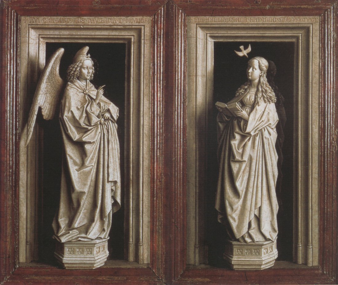
Grisaille painting is monochrome or almost monochrome and was often made to imitate sculpture - for example these wings of a 15th century altarpiece depicting the Annunciation and the Angel Gabriel(3) by Jan van Eyck
Painting en Camaïeu was painting in tonal values a single colour to imitate ceramics or cameos. I could find very few examples of this Click here for an image
For definition (i) above a good starting point would be the drawings of Leonardo Da Vinci for example this study of drapery.(4) Here the artist has started on a mid toned ground and used charcoal or black chalk to describe the shadows and white chalk for the highlights to build the form and relief. He has "modelled the light".
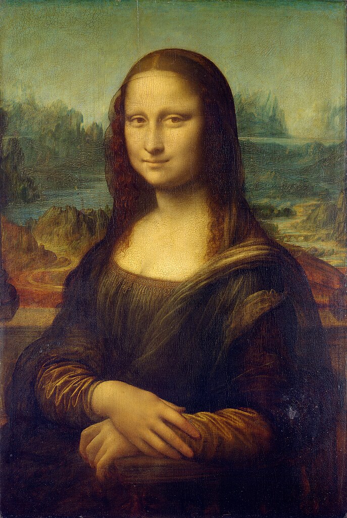
But Leonardo also provides examples of usage (ii) of the term chiaroscuro. For example in his famous masterpiece The Mona Lisa. (1503-1507) I saw this painting when I was a teenager during a visit to the Louvre on a school trip to Paris. I remember being somewhat underwhelmed as the painting was so much smaller than I had expected and was quite dark and surrounded by crowds of people which meant I couldn't get close to examine it. However, it does exemplify both of the common definitions of chiaroscuro given above. There is the modelling of form with light both on the drapery and on the facial features as well as a strong contrast between the dark shadows and the ethereal glow of the illuminated face. It also illustrates 'sfumato' (the Italian verb sfumare has various translations such as to fade away, vanish, obscure). In this context it means to blur or make transparent the edges of shadows to appear as though they are veiled in smoke. (2) This sfumato effect is particularly seen in the representation of the facial features.
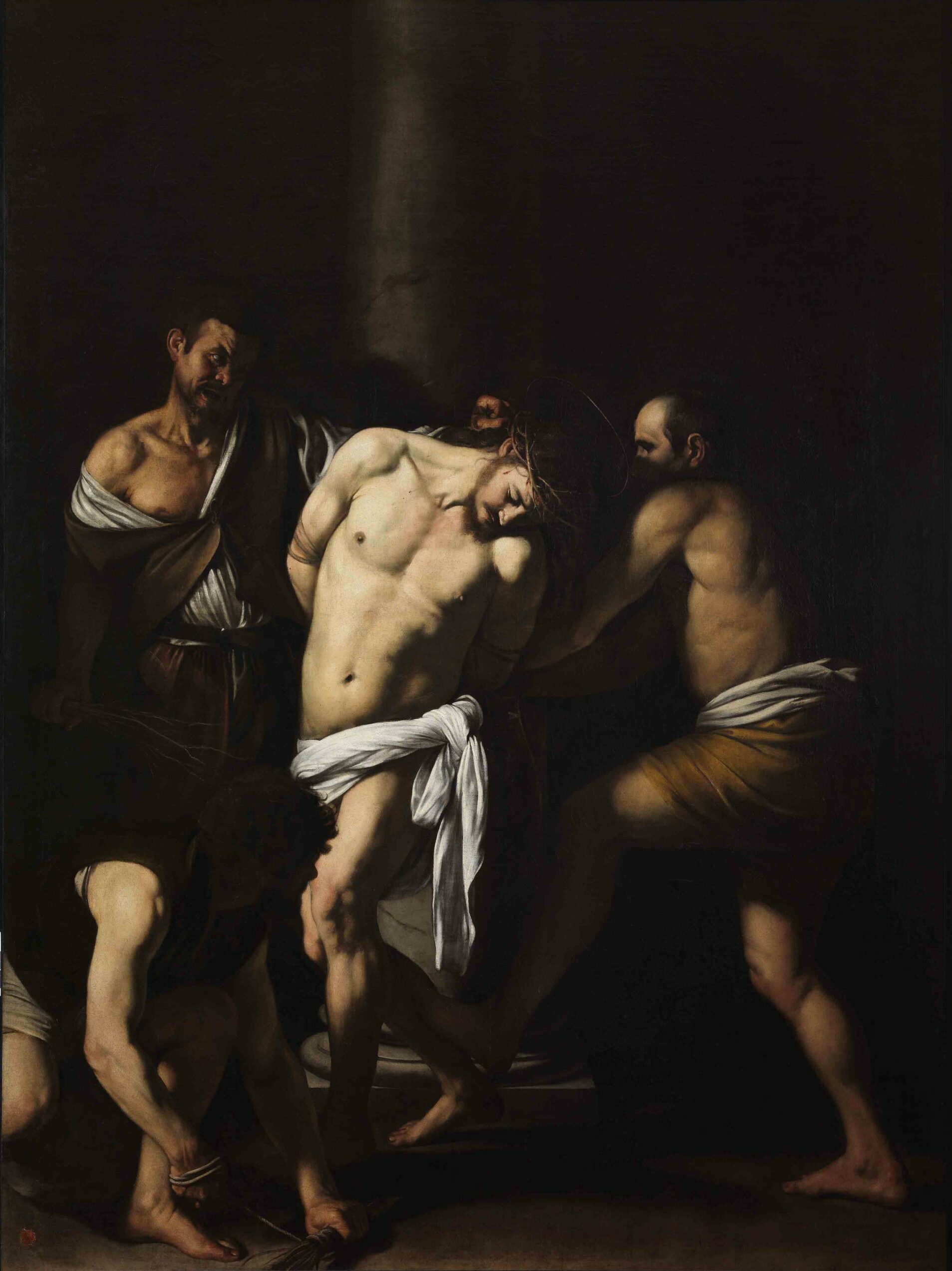
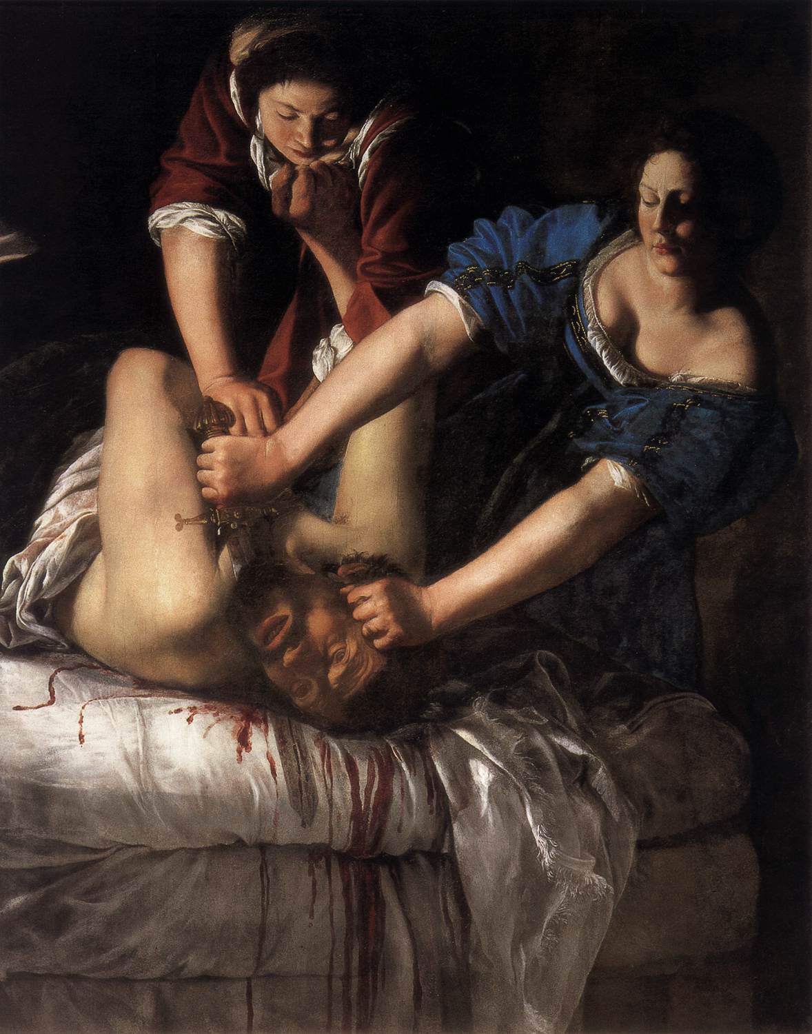
Definition (ii) of chiaroscuro is what comes to mind more readily in my previously uneducated mind. I am lucky enough to live near Naples and have made several visits to the Museo Nazionale de Capodimonte over the years. Two striking examples of works exemplifying the dramatic and expressive effects of Chiaroscuro seen here are Caravaggio's Flagellazione di Cristo (1609-1610) (5), (7) the cowed body of Christ is brightly illuminated whereas his tormentors are just partly illuminated in the shadows and the rest of the canvas is in complete darkness. The second example I would like to cite is Artemisia Gentileschi's Giuditta e Oloferne (1625-30) (6), (7) Here Judith and her servant are in the act of beheading the giant Holofernes. Again there is marked contrast between the dark background and the illuminated action - the arms they are carrying out the violence are the most illuminated part of the painting in particular Judith's arms which for a dramatic diagonal as she reaches down with the sword. This gives the whole composition a theatrical effect. In fact there was even more personal significance to this painting for Gentileschi as she uses her own self portrait to represent Judith and she is slaying her former mentor Agostino Tassi who was tried in court for her rape.(8)
There is a theatre group in Naples called Teatri 35 who exploit the drama and theatricality of these works of art creating "tableaux vivantes" representing works of art. I recently went to one of their workshops 'Caravaggio e i caravaggisti' (caravaggio and his followers) in which they physically represent the works of famous artists - They hold their poses for 20seconds allowing the audience to rapidly draw them. at the time I was struck by the drama of the poses. Only now am I realising how entirely appropriate the bright theatrical illumination in a dark theatre is to the representation of these works of art. You can read about my experience of the workshop in my learning log for Drawing 1 Click Here for link
The examples above might give the impression that chiaroscuro was a 16th and 17th century phenomenon. In fact the term surfaced in art theory in Italy in the 15th century -however use of graduations of light and dark to represent form started to emerge in the 13th century(2). Around the end of the 13th and the beginning of the 14th century Giotto was already mixing variable amounts of white pigment with colours to create tonal gradations to represent form For example in this panel painting - The lamentation of Christ.(9)
It was in the 17th century that the term came to mean more about the organisation of areas of light and dark in the composition on the canvas. I.e. the consideration of the chiaroscuro of the whole arrangement in addition to the chiaroscuro of individual elements of the composition - so the design of the whole canvas. The meaning was also extended to include lightness and darkness of colours independent of light and shadow.
In the late 18th century writings by Denis Diderot made a distinction between the chiaroscuro used in the representation of light and shadow and that attributed to the imagination of the artist for dramatic effect. The exaggeration of natural lighting conditions or careful selection of illumination were used to add emotional impact and enhance the expressive qualities of painting. (2).
Another term used to describe these paintings in which there is marked contrast between dark and light is 'Tenebrism' (10) (from the Italian 'Tenebroso' which means dark/shadowy/gloomy). This is a term used to describe the works of Caravagigio, Gentileschi, Tintorretto(11) and others. In fact the word 'tenebroso' was used as a criticism of these works of art in literature from the 17th to the 19th century - taken to mean the unnatural effect and perceived crudeness of their lighting scheme. So the marked chiaroscuro effects have fallen in and out of fashion over time.
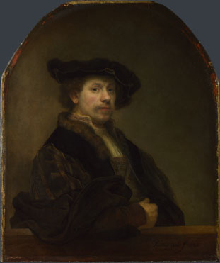
Another famous tenebrist artist who came to this way of working without having direct prior knowledge of Caravaggio is Rembrandt. For example this is seen in his many self portraits painted using candlelight illumination.
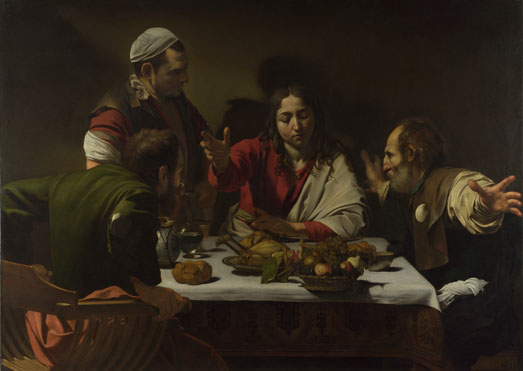
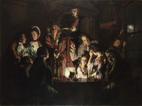
In August of this year I made a trip to the National Gallery where I saw several examples of chiaroscuro painting including Self Portrait at the age of 34 by Rembrandt (1640) (12), The Supper at Emmaus by Caravaggio (1601) (13) and Experiment on a Bird in the Air Pump by Joseph Wright of Derby (1768) (14). This illustrates that the taste for dramatic lighting in paintings extended beyond the boundaries of individual countries and also across centuries. The dramatic lighting might resulted partly from candlelight illumination but it seems to me more to have been motivated by a taste for drama. The work by Joseph Wright of Derby mentioned above seems to tip over almost into the melodramatic. It depicts a bird (a white cockatoo) being suffocated in a vacuum pump in front of an audience. The man carrying out the experiment is lit from below making his face look rather sinister and the illumination is greatest drawing our attention to the faces of two distraught young girls. I think the drama here is a bit staged and laboured so can see why 'tenebroso' might have been used as a pejorative term in the 18th century. To me this picture - while I can appreciate the skill of the painter it is all a bit 'OTT' in its dramatisation of the subject matter.
References:
(1) http://www.nationalgallery.org.uk/paintings/glossary/chiaroscuro
(2) Chiaroscoro. Janis Callen Bell. article from Grove Art Online via Oxford art online
http://www.oxfordartonline.com/subscriber/article/grove/art/T016397
(3) http://www.artbible.info/images/vaneyck_annunciatie_thyssen_grt.jpg
(4) http://uploads8.wikiart.org/images/leonardo-da-vinci/drapery-for-a-seated-figure-1.jpg
(5)http://upload.wikimedia.org/wikipedia/commons/0/0e/Caravaggio_-_La_Flagellazione_di_Cristo.jpg
(6)http://upload.wikimedia.org/wikipedia/commons/4/4e/Artemisia_Gentileschi_-_Judith_Beheading_Holofernes_-_WGA8563.jpg
(7) The National Museum of Capodimonte (Guide Artistiche Electa Napoli) Edited by Silvia Cassani. English Edition. Electa Napoli 2003
(8)http://en.wikipedia.org/wiki/Judith_Slaying_Holofernes_(Artemisia_Gentileschi)
(9)http://upload.wikimedia.org/wikipedia/commons/3/3a/Giotto_-_Scrovegni_-_-36-_-_Lamentation_(The_Mourning_of_Christ)_adj.jpg
(10) Tenebrism. Janis Callen Bell. article from Grove Art Online via Oxford Art Online. http://www.oxfordartonline.com/subscriber/article/grove/art/T083775
(11) http://uploads3.wikiart.org/images/tintoretto/self-portrait.jpg
(12) http://www.nationalgallery.org.uk/upload/img/rembrandt-self-portrait-age-34-NG672-fm.jpg
(13) http://www.nationalgallery.org.uk/upload/img/caravaggio-supper-emmaus-NG172-fm.jpg
(14)http://www.nationalgallery.org.uk/upload/img/wright-experiment-bird-air-pump-NG725-fm.jpg


_adj.jpg)