Friday 13 February 2015

Project - Still Life: Drawing in Paint

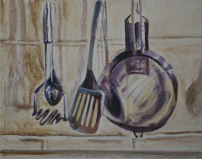
The aim of this exercise was to explore the linear qualities of a simple still life arrangement of household objects in their usual position. I was attracted to the kitchen utensils hanging on the tiled kitchen wall. 

I first made some small sketches starting with blind drawings and continuous line drawings:


I played around with composition in my A3 sketchbook and tried painting the linear elements with black paint. I realised that what I liked about my initial sketches was the quality of line that comes from continuous or blind drawing. I found it wasn't really possible get this when painting with a brush and paint (rather than ink) because I kept having to reload the brush (so lost the flow of continuous line. 

I tried loading diluted paint into a syringe and drawing with a needle attached - this didn't work as well as it had in my previous experiment in 'Drawing 1' with ink because the paint was much thicker and took more force to squeeze through the needle. I also had to have the needle in contact with the paper which was textured - the result was a rather juddery line - a long way from the confident continuous line drawing.


I went back to pen for working out the composition - these sketches are in my A3 sketchbook. I was happy to lose accuracy for the sake of flowing lines - the top one is with a sharpie marker pen and the bottom one with a finer drawing pen:


Next I followed the instructions in the exercise - I drew the linear elements of the composition  on Bockingford watercolour paper  (A2) using a brush and gouache and them worked back into this with gouache (and a bit of soft pastel in the background). It really wasn't working. It all felt very static and dull compared to the interest of the initial sketches. I also realised that this didn't emphasise the linear qualities of the objects as had been my original intention - I needed another approach. 


I had a brainwave! I had enjoyed drawing by squirting ink at the page in my previous course and thought that a way of getting a similar sensation with paint could be to use spray paint so I went to the local hardware shop and bough myself a spray can. 
I developed a greater respect for urban graffiti artists as I grappled with trying to draw with this somewhat uncooperative item! I also developed a banging headache despite wearing a mask and working in a well ventilates area with a a fan drawing the fumes out of the window - I think this might become summer activity so I can work outdoors.

I did a few practice sketches on A2 paper. This definitely works better the larger the paper The thickness of line can be varied depending on the distance of the nozzle from the paper but remains quite bold even at the closest position: 


Finally I drew my composition in spray paint on a sheet of A1 cartridge paper. Having established the linear elements in bold lines with the paint I then worked back into it with oil bars and oil pastels to establish areas of flat colour such at the tiles and the bright reflections from these metallic objects. I kept it quite simple; making no attempt to establish finely modelled surfaces - in this way the freshness and linearity was better maintained. I feel this painting is more successful than the gouache one on Bockingford paper. It has a more dynamic feel to it. Obviously the drawing is less accurate but I don't think that detracts - it probably adds to the feel that it was executed rapidly and is therefore more dynamic.


Tuesday 10 February 2015

Research Point: Still Life (Part 1: Dutch 17th Century)

Look at the work of some of the 17th century Dutch still life and flower painters . Make notes on paintings that you especially admire and find out more about the techniques that were employed at the time. Research at least one painting that has iconographic significance. Which of the objects depicted carry particular meaning and what was that meaning?

Introduction

The Dutch term 'stilleven' was coined in the 17th century and this is where the English 'Still Life' is derived from. (1) This was a period of development of trade and wealth in the Dutch Republic and middle class merchants had disposable income which they could spend on paintings to adorn their homes(2). There was ,therefore, a period of profuse production and selling in the art market.

There are two theories about how still life developed as a separate genre in the Netherlands:
One idea is that it is a direct descendant of Roman frescoes and mosaics and frescoes depicting animals and fruits which decorated the walls of Villas. Several of the mosaics from Pompeii have been preserved and I have admired them many times Click here to view a fine example of a sea creatures mosaic courtesy of Wikipedia. Eventually, by the 15th century in Italy tromp l'oeil marquetry panels were on the walls of wealthy people's homes and Charles Sterling proposed that the still life evolved from these.(1)

Perhaps a more convincing theory is that the still life developed from religious paintings. Still life elements were included in Dutch religious paintings from the 15th century onwards. The objects include would often have a symbolic meaning related to the main religious action of the painting.

In the 16th century, Flemish Mannerist painters started to make the still life elements more important with the religious scenes no longer dominating but occupying a small space in the background. (1) an example of this is seen below in Pieter Aertsen's butchers stall with the flight into Egypt. Meat and other foods clutter and dominate the foreground of the painting (the severed cow's head seems to be almost alive and staring out accusingly at us). In the background, the religious scene is subordinate and can only just be made out through the open archway/door of the stall. The inclusion of all the meat may have something to do with the depiction of transience and awareness of mortality. I will talk about this in more detail when I describe 'Vanitas' paintings. 


Pieter Aertsen: The Butcher's Stall with the Flight into Egypt 1551
Oil on Canvas (Source - Wikipedia)
Eventually, the still life elements were liberated completely to become the entire subject of paintings but may objects maintained their symbolic meanings and people of the day would have been able to read the hidden language of the still life pieces.

Looking at still life painting of the Dutch golden age from the perspective of a 21st century viewer, it is tempting to be dismissive because the painting is hyper-real and the subjects are faithfully and accurately represented. This is a function which in this day and age can be carried out by photography. Obviously in the 17th century this was not possible The high level of skill and the sensitivity of the painting of these masters is undeniable. Accuracy and realism were the primary indicators of quality in painting in this era. Nevertheless, due to the hierarchy of genres that existed in art theory, still life painters were still considered: "The common foot soldiers in the army of art" (Samuel van Hoogstraten) (2). Their more elevated counterparts for example in history painting were subject to strict theoretical guidelines and critical scrutiny. Receiving less critical attention, the still life painters were freer to experiment and develop their work. I see a parallel here in the recent development and pushing of boundaries in the field of drawing. Being less exposed to critical derision can allow greater creativity.

Techniques of the Dutch Masters

The production of such realistic works of art becomes all the more impressive when you consider they there were fewer pigments available to painters in the 17th Century. There was no commercial production of paints in tubes. Pigments would be ground by had each day and combined with a painting medium such as linseed oil. (3)

There are very few records of painting techniques from the period in question because painters were trained by being apprenticed to a master rather than learning in college or from books or manuals. Scientific methods including X-rays and infrared techniques have shed some light on the working methods used:(3)

Care had to be taken as many of the pigments used had quite differing characteristics in terms of drying time and application and some would not be compatible with each other. Given the laborious preparation of paints required each day it was common for artists to work on a small section of a painting at a time. The process of creating a painting went in four district stages:(3)

(1) Inventing - planning and drawing the (often complex) composition
(2) Dead Colouring- monochromatic underpainting to establish the main tonal zones
(3) Working up and Finishing - Applying the pigments - working on one small area of the painting at a time as described above
(4) Glazing - This layers of translucent paint would be applied over certain areas of the composition to modulate the colours.(3)


Examples of Dutch Still Life Paintings

Flower Piece

Two very famous proponents of flower painting were Abrosius Bosschaert the Elder and Jan Davidsz de Heem. The example I have chosen here is by the latter. I love the visual impact created by the wide tonal range in this piece with the almost black background and bright colours of the flowers ranging right through to bright white. There are elements spilling over the edge of the table and the stalks of wheat, flowers and berries are skilfully arranged so that all of the elements seem to link together and the eye is drawn around the whole composition. The artist has captured the delicacy of the flower petals as well as the smooth reflective nature of the vase. 
 

Jan Davidz de Heem (c1670) Oil on Canvas
(source:wikipedia.org)
Flowers were extremely popular in 17th century Holland. Collectors of Tulips paid extraordinarily high prices for tulip bulbs of special varieties. It would not have been common to have cut flowers in a vase at home being an expensive and perishable commodity, but flower enthusiasts would pay well to acquire beautiful paintings of flowers to decorate their homes.(1)

The paintings were often composed including flowers which bloomed at different times of year - so were not entirely 'realist' in nature. The painting illustrated above is no exception, containing irises and tulips which are spring flowers alongside yellow ears of wheat which would be expected to be seen around harvest time (late summer/early autumn). The fruits are also not all of the same season. There are blackberries (autumn) alongside apricots (late spring/early summer). This suggests that the painter made studies of the individual elements at different times of year and then designed the composition from pre-existing sketches rather than painting directly from life. 

Many flowers had symbolic value in paintings. For example lilies were a symbol of purity and the Virgin Mary. The overarching theme of the flower paintings (as well as the butterflies and fruit featured) was linked to their perishability or short lifespans. This was a reminder of the transience of life. The butterflies also symbolise the life of the soul after death as they flutter around - no longer weighed down by earthly desires.

Breakfast Piece

Below is an example of an earlier painting which is known as a breakfast piece. Again there is a very dark background allowing the still life elements to stand out. There is a good sense of depth in this piece although the viewpoint is quite high - the items are laid out on a tabletop and the plate and curls of apple peel protrude over the edge of the table adding to the perception of depth and space. The knife has been arranged to create a diagonal which draws the eye up from the lover left into the centre of the composition. The apples and bread then draw the eye back around into the canvas. What I especially appreciate about this painting is the rendering of the different textures - the surface of the bread looks as thug you could reach out and touch it. There are beautiful reflective surfaces on the plates. The cracked cut surfaces of the cheeses. Particularly impressive is the contrast between the slightly browning flesh and the more lustrous outer skin of that curl of apple peel. 

The whole composition is laid out with cutlery and plates and nuts and fruit placed in an apparently (but not actually) haphazard way to look as though someone has just been eating.


Floris Claesz Van Dijk (1610). Oil on Canvas
(source:wikipedia.org)
Breakfast pieces typically depict everyday utensils and cutlery. There is a simplicity about the food too. These are not ostentatious displays of wealth. There is symbolism here too - these arrangements show the virtue of temperance and a modest lifestyle. Once again there is also the reminder transience - the food is all perishable just like a human life.(1), (2). In the picture above, a large dark blemish on one of the apples in the bowl serves as a further reminder of this.


Vanitas

"Vanitas vanitatum omnia vanitas"

"Vanity of vanities, saith the Preacher, vanity of vanities; all is vanity.
What profit hath a man of all his labour which he taketh under the sun?
One generation passeth away, and another generation cometh: but the earth abideth for ever." (4)

These are the themes that are explored in the vanitas still life. But it is not primarily the mirror-gazing, narcissistic modern meaning of vanity that is being explored. Rather the meaning of futility - the sense of human activity on earth being 'in vain'.

The painting by Pieter Claesz below I have chosen because it has a quietness about it. It is not overblown. The colours are muted harmonies of browns, ochres and lovat or sage green which suit the sombre subject matter. Claesz has used different techniques and marks to show the various textures from the soft cloth to the gently reflective surface of the solid skull. I also particularly like the delicate rendering of the irregular edges of the pages of the book.
The composition has a diagonal movement to it with the watch key the watch and the overturned glass all leading our eye up towards the main focal point of the skull.


Pieter Claesz (1630) Oil on Canvas
Every item in Claesz's painting above carries a symbolic meaning:

Watch - The passage of time
Oil lamp (snuffed out and smoking) -Brevity of life
Glass fallen on its side (and therefore empty) - life is fragile and brief
Skull - memento mori - all life ends in death and death is a leveller
Quill and Books - a reminder of man's vanity and the false values of earthly life - (we are all the same in death and learning cannot overcome death) (1)

All vanitas still lives carry the theme. That of man's achievements on earth being in vain and that we should remember that we will all be dead soon should we start to become too grandiose.


Pronk Still Life

Later in the 17th century still lives emerged which seemed to be the opposite of the breakfast pieces and the vanitas paintings in that they reflected the accumulation and display of wealth and pride in possessions. However, religion was very much part of life and the protestant, (Calvinist) doctrines of the day would still have advocated temperance so the still lives also reflect some ambivalence and guilt around these material possessions. 
Often there was reference to all of the five senses (including musical instruments as well as food, drink and beautiful objects) as subtle warning of the moral danger of gratifying all the senses while on earth. Wine was also included as a symbol of the resurrection of Christ. (1), (2)

In the 'pronkstilleven' (ostentatious still life) below by Willem Kalf there is another commonly used symbol - the partially peeled lemon. It was common to see long and complex swirls of lemon peel curling over the edge of the table in still lives in this era. Not only were they a demonstration of the virtuosity of the artist but also the lemon represented a life that is beautiful to look at but bitter to taste. (1), (2).

The work below by Willem Kalf is quite typical of his output. He preferred small groups of sumptuous objects.  He employed a chiaroscuro arrangement of the tonality for visual impact which may have been influenced by Rembrandt. His work is very much about surfaces. The intricate reflective surface of the silver work around the drinking horn. The reflective yet transparent fancy glasses. The complex folds and patterns of the luxurious Persian carpet. My eye is most drawn, however to the beautiful colouration of the sumptuous lobster. 


Willem Kalf (1653) Oil on Canvas

References:
(1) Dutch Painting in the Seventeenth Century. Madlyn Millner Kahr. Harper and Row. 1978

(2) Dutch Painting. R.H. Fuchs World of Art. Thames and Hudson 1986

(3)Essentialvermeer.com - Vermeer's painting technique: A Five Part Study http://www.essentialvermeer.com/technique/technique_overview.html#.VQ2PFEvfYYU

(4) Ecclesiastes, Chapter 1- King James Bible (online source)
http://www.kingjamesbibleonline.org/Ecclesiastes-Chapter-1/

Friday 6 February 2015

Understanding Colour: Complementary Colours

The first step in this exercise was to construct a colour wheel like that of Chevreul and to identify the complementary colours. Unfortunately I ran out of the Winsor and Newton primary yellow when mixing my yellow-green and had to use the lower quality Rowney paint. I think you can clearly see the difference in quality in terms of coverage - the Rowney paint contains more filler and less pigment. I have ordered some more of the Winsor and Newton Designer's gouache.


Next, samples of complementary colours were placed alongside each other on a neutral grey background. Whit had been added to the darker of each pair to try to make the tonal values more similar. These colours were then mixed together and then more white added. The next task is to attempt to describe the resulting colours. This might sound simple but is actually a difficult task because of the lack of a very extensive and precise standard vocabulary for the description of colours. The mixture of these colours was also fairly haphazard - mixing different proportions of each colour in each case would result in different tertiary or broken colours. also the different strength of pigments in the different quality paints may have altered the results. 


Orange + Blue gave a muddy olive or lovat green which appeared brighter when mixed with more white - like a mint green but with more yellow overtones

Red + Green gave a very dark tone which read as almost black but could be seen to contain a hint of red. On mixing more white into this the result was a slightly purplish grey. This appeared to me to be the closest to achromatic of all the greys I produced in this exercise.

Red Orange + Blue Green produced a dark khaki which when mixed with white produced a sage green.

Yellow Green + Red Purple produced a cool dark brown. Mixing additional white into this  gave a pinkish clay-coloured taupe.

Yellow Orange + Purple Blue gave a muddy yellow-green somewhere between mustard yellow and olive green. The addition of white produced a yellowish cream. 

Yellow + Purple produced a surprisingly bright sunshine yellow (perhaps the proportion of yellow was too high in this mix to dull the chroma). I added a bit more purple which produced a dull but warm peach colour.

Describing these colours has been very difficult and I do not think it would be possible for another person to reproduce these colours accurately from my descriptions - this is a clear illustration of the difficulties with colour vocabulary and shows why many paint manufacturers resort to numbers to categorise colours. 


I played around with some of the
leftover colours to see what placing
them in various combinations would do.


Understanding Colour: Broken or Tertiary Colours

In this exercise I made a scale from orange red (vermillion) to green blue (cerulean) and a second scale from orange to violet. White was mixed with the combinations to try to maintain equal tones throughout. It can be seen from the subsequent greyscale photograph, that my attempt to maintain constant tonal value wash't really successful - there is really quite a lot of tonal variation here. 


The middle part of the scale shows loss of chroma - these are broken or tertiary colours. They are greys although they are not completely achromatic.


Saturday 17 January 2015

Understanding Colour: Primary and Secondary Colour Mixing

Key: PYD = Primary Yellow Dark, PY = Primary Yellow, LY = Lemon Yellow
NY = Naples Yellow, YO = Yellow Ochre, SR = Spectrum Red, PR = Primary Red
CR = Crimson, VE = Vermillion, BR = Bright Red, CE - Cerulean, PB = Primary Blue
UL = Ultramarine.
The first step in this exercise was to identify the differences in tone, hue and chroma between the yellows, reds and blues taken directly from the tube. I decided to use gouache for this exercise as I had a wider range of colours to choose from. However, I had two different qualities of gouache. The Windsor and Newton Designers Gouache was of better quality than a pack of Daler Rowney 'Simply Gouache' - these paints had a larger amount of 'filler' compared to pigment and were consequently less intense and more difficult to handle - I won't buy them again. 

All of the yellows were relatively light in tonal value. The primary yellow appeared to be the lightest but its value was quite similar to the lemon below and naples yellow. The Primary Yellow Dark and the Yellow Ochre were darker in value than the remaining yellows but nowhere near as dark as any of the reds or blues. 
Lemon yellow had a touch of green to its hue and this became more noticeable when it was placed adjacent to the Primary Yellow Dark and Yellow Ochre which have an orange and a brown component to them respectively. Naples yellow appeared to be very slightly more orangey than primary yellow but was significantly less intense. 
Lemon Yellow and Naples Yellow were the least intense of the yellows - this may also have been a result of these being the poorer quality paints. Primary Yellow was the most intense so I chose this as my primary yellow.

The reds were more mid-range in total value. Vermillion appeared to be lighter in tone than the rest of the reds but the rest were fairly similar in tone.
Vermillion tended towards the orange end of the spectrum. Crimson was the red containing the most blue. Primary Red and Bright Red also contained a hint of blue. 
Primary Red and Spectrum Red were the most intense reds but I chose Spectrum Red for my primary red as it was less blue.

There was a range of tonal values amongst the blues. Cerulean was the lightest and ultramarine the darkest blue. 
Both Cerulean and Primary Blue showed some greenness whereas ultramarine tended more towards purple. Ultramarine was the most intense blue but had too much red in it to represent a true primary blue so I mixed my idea of a primary blue from a combination of Ultramarine and Primary Blue. 

At the bottom of this sheet I mixed a scale from yellow through to red. However it wasn't  until after I'd done this that I realised I had used PYD instead of PY. I had subconsciously picked up the most orange yellow when mixing this scale.


Key: PY = Primary Yellow, SR = Spectrum Red, PB = Primary Blue,
UL = Ultramarine, VIO = Violet, CR = Crimson, PR = Primary Red
MA = Magenta, WH = White
Next I used my chosen primary colours to mix secondary colours. Yellow to Red, Yellow to Blue and Red to Blue. I made too many gradations at the yellow end of the yellow to blue gradation so didn't leave much space for darker and bluer greens at the other end. The red and blue mixture did not produce violet but more of a burgundy/maroon colour. A better violet was produced by mixing ultramarine with either crimson, primary red or magenta. 

The next task was to repeat these three graduations but to mix white into the darker toned colours to try to maintain a constant tonal value. I found this very difficult to judge - the different colours confused me as regards tonal values - looking at the ranges afterwards It looked to me as though the tones got darker from left to right and then I over compensated with too much white in the blue at the right side. I took a photograph of this sheet in black and white to asses this.


It was clear from this that there was a slight graduation from light to dark on the yellow to red graduation (not enough white added to compensate for the darkening caused by the addition of red). In both of the others I had over compensated by adding too much white to the blue at the right side.


Understanding Colour: Mixing Greys - Anachromatic Scale

This exercise required the mixing of black into white paint to create a progressively darkening scale with the final step being black directly from the tube.


On my first couple of attempts at this, some of the tonal values in the mid range were very similar to each other. I gradually came to realise that it was not sufficient to mix the same amount of black into the mixture each time to make a stepwise tonal gradation. As the tone got darker, a progressively larger volume of black paint needed to be added to make and appreciable difference to the value.


My final attempt has nine steps although step 7 and 8 are quite similar compared to the the rest of the steps so in retrospect it probably should have stayed as an 8 step scale.  I then took scraps of paper painted with a mid-range neutral great and placed them at each end of the scale.  The result is that the grey placed adjacent to the white end of the scale appears relatively darker in tone and the grey placed adjacent to black appears relatively lighter. 

The neutral grey was then used as a base colour for the subsequent colour mixing exercises.

Friday 16 January 2015

Research Point : Chevreul's Colour Theories

Find out more about the colour theories of Chevreul and make notes on how particular artists have used Chevreul's theories to expand the possibilities of painting.

Introduction

I really enjoyed this research point although it was a very involved and extensive piece of work.
I have been interested in colour ever since I was a small child when I would obsessively arrange my felt tipped pens and coloured pencils into colour graduations. When I did 'O' level art at school, my mum lent me a book about colour which I pored over and in the process acquired a very rudimentary understanding of complementary colours. This resulted in multiple paintings of green and red peppers. At 'A' level back in the 1980s we painted colour wheels and did exercises about colour harmony but Chevreul's name was never mentioned. It never occurred to me to question where the information about contrasting colours and the colour wheel had come from. I just took it for granted that the rules I was given about complementary colours and their mutual enhancement when juxtaposed as well as the effect of mixing red and green in the shadows for my peppers were common sense and common knowledge . It wasn't until I visited an exhibition at the National Gallery in London last summer entitled 'Making Colour' that I first heard of Chevreul. The exhibition was mainly concerned with the production of pigments however one of Chevreul's colour wheels was exhibited in the first room of the exhibition. In the gallery bookshop after the exhibition I coveted a copy of John Gage's 'Colour and Meaning: Art, Science and Symbolism' Thames and Hudson 1999 (reprinted 2013) but couldn't justify the expense of buying it. This research point gave me the perfect excuse and I have enjoyed reading this text which approaches colour in the context of art history looking at the very complex world of colour research and theories including physics, physiology, psychology, neurology and philosophy. I will confine my discussion here to Chevreul and much of the information here will have come from this text but also from a more succinct summary of Chevreul's work which I found on the Internet 'Chevreul's Colour Theory and its Consequences for Artists' by Georges Roque Click here to link to the paper published by the Colour Group (Great Britain). I will write a subsequent essay highlighting some of the other areas of colour research which I found interesting.

Chevreul's Life and Work

Michel-Eugene Chevreul (1786-1889) was a chemist and a very successful one. His interest in colour arose because he was employed by Gobelin's manufacture in France. In 1824 he was made their director of dyeing (1),(2). His task was to oversee the dyeing of wool and silk for the manufacture of furniture, carpets and tapestries. His interest in the interaction of colours was stimulated by his observation of unforeseen effects of one colour of thread on the apparent colour of another - I will go into this in more detail later

In 1828 he published 'memoir on the influence that 2 colours can have on each other when seen simultaneously'(2) which introduced his theories of simultaneous and successive contrast. In 1839 he published a much more in depth book about this subject ' On the law of simultaneous contrast of colours and its applications to......' (many applications were listed including painting). 
Chevreul continued to publish on this subject throughout is very long career (He worked until the age of 97). Other publications include 'Chromatic Circles' 1855, 'Outline of a way to name and define colours' (1861) and 'On colours and their applications to the Industrial Arts' (1864)(1)

Law of Simultaneous Contrast

'In the case where the eye sees at the same time two contiguous colours, they will appear as dissimilar as possible, both in their optical composition and in the strength of their colour' (1)

The development of this theory was stimulated by a perceived problem with the dyeing of black thread which was to be used in blue and violet fabrics. Weavers complained that the thread was not dyed adequately because it appeared dull. When Chevreul analysed samples of the wool he found that there was no problem with the dyeing. He therefore developed his theory that the wool appeared dull because of the the effect of the colours it was placed with. Hence the problem was not actually to do with chemistry which was his speciality but was about how the colours were being perceived, a potentially even more complex area involving physiology, neurology and psychology. (1)

He proposed that the brain has a tendency to exaggerate the differences between adjacent colours and also between adjacent areas of different tonal values. Hence a dark grey placed next to a light grey will appear darker especially along the border - where the light grey will appear lighter. A green placed next to a red will look greener and the red will look redder. He defined this as follows:

'If we look simultaneously upon two stripes of different tones of the same colour, or upon two stripes of the same tone of different colours placed side by side, if the stripes are not too wide, the eye perceives certain modifications which in the first instance influence the intensity of the colour, and in the second, the optical composition of the two juxtaposed colours respectively. Now as these modifications make the stripes appear different from what they really are, I give to them the name of simultaneous contrast of colours; and I call contrast  of tone the modification in intensity of colour and contrast of colour that which affects the optical composition of each juxtaposed colour' (1)

Chevreul knew about complementary colours and the source of this knowledge was the work of Buffon. In particular his observation of 'accidental colours' which he published in 1743.  Buffon had noted that when looking at a spot of a particular colour on a white background, a halo of the complementary colour would be be perceived around the spot. In addition, after staring at a spot of colour for example a spot of red on a white sheet and then staring at a blank white sheet then an image of a blue-green spot (the complementary of red) would be seen. (1)

Chevreul proposed that ' Two juxtaposed hues will be perceived as the most different as possible when the brain adds to the perceived hue a little of the complementary of the juxtaposed hue and vice versa' (1)

This seems to be analogous to the 'halo effect' observed by Buffon.

To make this clearer it could be illustrated by imagining a white pattern on a red background. Depending on the size of the white motif compared to the area that is coloured red, the white pattern may appear to be tinted green. This can be counteracted by adding a hint of red to the white. This is something which would have proved very useful to those in the business of producing textiles and wallpapers. 

Chevreul also concluded that when two complementary colours are juxtaposed that mutual enhancement occurs. 

Chevreul's law does depend on the size of the samples juxtaposed. Large samples of colour placed adjacent to each other obey the law of simultaneous contrast at their edges whereas small marks and threads become assimilated. This was a criticism aimed at Chevreul but Chevreul was aware of this and had not overlooked this phenomenon :

'There is a contrast of colour whenever differently coloured surfaces are properly arranged and susceptible to being seen simultaneously and perfectly distinct from each other" Whereas " There is a mixture of colours whenever materials of various colours are so divided and then combined that the eye cannot distinguish these materials from each other in which case the eye receives a single impression. ' (1)

The phenomenon described above Chevreul applied for example to the mixing of thread in tapestry. The application of Chevreul's law to different sized samples of colour was to cause subsequent confusion in the development of the theories in particular of the neo- impressionists and pointillists - this will be covered in greater detail in a later research point about optical effects. 
Chevreul considered this mixing of colours by the eye to be a sort of subtractive mixture. We would today call this assimilation or optical mixture.
Chevreul's work was subsequently criticised because when he explained his observed phenomena there was confusion between additive and subtractive colour mixing (mixture of light versus mixture of pigments). This confusion about the physics of colour was widespread  in Chevreul's time. (1)

Chevreul's Influence on Artists

Chevreul's theories were exerting an influence on artists even before his book was published because he gave a series of public lectures between 1830 and 1850.
Initially the most enthusiastic recipients of his work were people working in the applied or decorative arts rather than fine art painters. They found practical applications for his theories in the distribution of colour in many fields of endeavour. 

Painters who did consult Chevreul initially included Louis Hersent a neo-classical painter and a professor ay L'Ecole des Beaux-Arts. He was also consulted by Louis Daguerre during the period in which he was painting dioramas. 
Chevreul became good friends with the painter Horace Vernet. Vernet's specific area of interest was in the painting of battle scenes. However, none of the above named painters allowed Chevreul's theories to exert a major influence on their work. In fact Vernet was criticised for exhibiting poor colour harmony in his work. (2)

Chevreul's theories were primarily of interest to artists who wanted to apply science to achieving greater colour intensity in their works and were looking for simplified rules to follow. However, there is some confusion and in Chevreul's time there was widespread misunderstanding as to what Chevreul's intention was. It was taken as fact that Chevreul would have recommended painting the simultaneous contrast of colours. In fact he was more an advocate of "contrasts of analogous colours" that is colours that have similar lightness. He also advocated 'economy of means' and painting in flat tints with reference to oriental painting. This was an area of interest to neo-classicist and romantic painters in 19th century France. This can be seen in the following examples of paintings by Delacroix and Ingres.(2), (1)


Eugene Delacroix: Algerian Women in their Apartment
Oil on canvas 1834 (picture source: wikipedia.org)

Eugene Delacroix: Entry of Crusaders into Constantinople
Oil on canvas 1840 (picture source: wikipedia)


Jean Auguste Dominique Ingres: Odalisque with
a Slave
Oil on canvas 1842 (picture source wikipedia.org)
Unfortunately, time has taken its toll on these paintings and the colours have changed making the effect of the juxtaposition and arrangement of colours less easy to read. In the Delacrox painting of the Algerian women there are almost (but not quite) Chevreulian complementaries with the arrangement of orange and blue. In his painting of troops entering Constantinople he particularly took care to juxtapose complementary colours on the flags - blue and orange, yellow and violet and red and green were juxtaposed - the effect can't be as clearly seen today because of the degeneration of the paint.

In the painting by Ingres shown above, red and pale green are placed alongside each other to heighten the impact of the red. This suggests that Ingres may have been aware of Chevreul's work. However, I can't find any reference to Ingres and Chevreul ever meeting apart from Chevreul's comment to the painter Signac (when he visited him towards the end of his life) that he should consult Ingres who would tell him all he needed to know about his theories (unfortunately Ingres was already dead).

Delacroix, however, was known to have bought lecture notes from someone who attended one of Chevreul's lectures and he also had made an appointment to visit the chemist (but had to cancel owing to illness so never actually met him). So he was clearly interested in these theories. (1)

Impressionism

The impressionists would not have been too keen to admit to the influence of Chevreul on their work as their apparent aim was to paint exactly what they saw and depict the effects of light. However, Chevreul's work suggests that this is not actually possible because of the changes in perception of colours and tones when they are juxtaposed.
There is, however, some potential evidence of the influence of Chevreul on the painting of several impressionist painters. Look for example at Monet's poppy field of 1873. Click Here to view on the Musee D'Orsay Website . We can see a skillful use of red and green here. Monet himself said, " Primary colours look brightest when they are brought into contrast with their complementaries".

Pisarro was the first of the impressionists to put his paintings in white frames and also to tint his stretchers with the complementary colour of the dominant hue of the painting. This is clear evidence for the conscious application of Chevreul's theories. (1)

Neo Impressionists

These artists moved away from the impressionist ideal of looking directly at the effect of light in nature and became more concerned about the organisation of the pigments on the canvas. I will include more detail about the work in particular of Seurat and Signac in the research point later in this section about optical effects.
Signac visited Chevreul, and Seurat also said that the chemist was an influence in the development of his technique. Looking at the two paintings below there is evidence of attempts to apply Chevreul's theories in the development of the technique of pointillism.(1)

Paul Signac: The Breakfast. 1886-87 Oil on Canvas
(Source: wikipedia.org)

Georges Seurat: A Sunday afternoon on the Island of La Grande Jatte
1884-86 Oil on Canvas. (Source: wikipedia.org)
Both artists have placed dots of complementary colours adjacent to each to each other, aiming to make their paintings visually more exciting and luminous. This is more obvious in the reproduction of the Signac painting above and does seem to create a liveliness or vibration on the canvas. It is more difficult to see the technique on the small scale reproduction of the Seurat painting. In fact it almost seems as though the colours are somewhat greyed in the Seurat reproduction. I will go into greater detail about how successful or otherwise the techniques of the neo-impressionists were in the subsequent research point about optical effects. (1), (3)

Post Impressionists:

The Fauves

Perhaps unsurprisingly the next group of artists wanted to move away from the pointillist or divisionist style. They though that contrary to the stated aim of increasing vibrancy that the dotted application of the colour caused a reduction in the vibrancy of each adjacent colour (more on this later under 'optical effects'. The fauves, reacted against this and started painting in large areas of flat pure colour of contrasting hues.(4) Examples are shown below:

The Green Stripe - Portrait of Mme Matisse
Henri Matisse. 1905. Oil on Canvas 

(Source: wikipedia.org)


Estaque: Andre Derain. 1905. Oil on Canvas
(Source: wikipedia.org)

In both off the examples above it can be seen that there is little attempt to build form with light and shade. Instead, flat areas of bold colours are juxtaposed. Red and pink re contrasted with green in the Matisse portrait. In the Derain Landscape there are many examples of complementary colour contrasting with each other - in particularly red with green and orange with blue. Chevreul himself was an advocate of painting with flat as I have mentioned above. (2)

Van Gogh was also interested in the use of complementary colours, not only from the point of view of the visual impact and harmony of the colours but also in terms of their potential symbolism. He explained his aims in his letters to his brother Theo. He made studies of flowers:
"Seeking oppositions of blue with orange, red and green, yellow and violet. Seeking broken and neutral tones to harmonise brutal extremes. Trying to render intense colours and not a grey harmony" (1)


Vase with Pink Roses: Vincent Van Gogh. 1890.
Oil on Canvas (Source: wikipedia.org)
Link to Van Gogh's - The Sower 1888 (wikimedia.org)

In the painting 'Vase with Pink Roses' there is a subtlety to the contrast of the touches of pink in the roses with the green of the leaves and the paler greens of the table and the background.  In 'The Sower' there is a similar contrast of marks of orange and blue as is seen in Paul Signac's 'The Breakfast'. There is an aspect of pointillism to his technique but the marks made in laying down the colour are larger and bolder- (more clumsy but not in a bad way). 

Van Gogh also wrote that in his 'The Bedroom' of 1888 (below) he thought that the combination of colours he used should provide a restful sensation for the viewer. He had carefully planned the positioning of the colours on the canvas. (1)

Vincent's Bedroom in Arles. Vincent Van Gogh. 1888
Oil on Canvas (Source: vangoghgallery.com)


Abstract Artists

Robert Delaunay started to experiment with pure abstraction in 1912. He and his wife Sonia co-founded the movement which came to be known as Orphism. Before this, however, he and Jean Metzinger made a development from pointillism using larger mosaic-tile reminiscent marks of flat colour. They called this 'divisionism' 


Click here for an example of a divisionist Landscape by Robert Delaunay on wikigallery.org

From 1912 - 1914 came the development of  'Orphism'. Delaunay started to paint abstract work and was mainly concerned with the dynamic possibilities of bright colours - so the colours themselves would be the form of the painting. He found in the work of Chevreul, a set of rules he could apply to organising his colours and he freely admitted to the influence of,"The Brilliant Chevreul". (1)
Delaunay's state aim was to generate "colour movement'. He terrorised that complementary colours were harmonious and vibrated slowly when placed together whereas colours close to each other on the colour wheel would vibrate quickly. He thought that the arrangement of there vibrations on the canvas would give dynamism or colour movement. (1)
Disque Simultané. Robert Delaunay.
1912. Oil on Canvas. The inclusion of the word
Sumultané in the title signals Delaunay's interest in
Chevreul's theories 
(Source: wikipedia.org)
The disc paintings also show Chevreul's influence in that they are an investigation using areas of flat tints (4)

Link to Simultaneous Contrasts: Sun and Moon 1913 (moma.org)  This painting also illustrates a similar dynamism through juxtaposition of colours.

Delaunay's theory of colour movement didn't come directly from Chevreul, but he did get influence from Chevreul's study of stained glass windows. The chemist said that they were a great example of simultaneous contrast because they offered well defined distinct sections with vivid colours which contrasted against each other and against the opaque leading between the panes. 
Delaunay was inspired by both the transparency and the contrast and symmetry to paint a series of paintings based on windows. In these paintings there are angular areas or colour with both hard and soft edges - here the influence of cubism and Cezanne's painting technique can also be seen. 

Link to Simultaneous Windows on the City. 1912 (wikipedia.org)

Several other artists were investigating these phenomena at the same time, Notably Fratišek Kupka and Sonia Delaunay. I will go inter greater detail about the work of Sonia Delaunay after I attend the Study visit to her retrospective exhibition an Tate Modern in April.

Link to Frantisek Kupka - Positioning of Mobile Graphic Elements. 1913 (wikiart.org)

Link to Sonia Delaunay - Electric Prisms. 1913 (wikiart.org)

The work of Chevreul has continued to influence artists either directly or indirectly until today. This as also partly due to the fact that his theories were heavily influential on two of the great teachers from the Bauhaus - Johannes Itten and Josef Albers. Both of these teachers wrote books on the subject of colour Josef Albers - Interaction of Colour and Johannes Itten - The Art of Colour. Both of these texts borrow heavily from Chevreul's work.(1) I will include more detail about this in the subsequent research point about optical effects.


References:
(1) 'Chevreul's Colour Theory and its Consequences for Artists' by Georges Roque. Based on a paper presented in Paris in June 2010 to the Colour Group (GB) meeting colour and textiles: From Past to Future. Published by The Colour Group (Great Britain) http://www.colour.org.uk 2011

(2) 'Chevreul between Classicism and Romanticism' (Chapter 15: pages 196-208) in 'Colour and Meaning- Art, Science and Symbolism' by John Gage. Thames and Hudson 1999 (Reprint 2013)

(3) 'The Technique of Seurat - A Reappraisal' (Chapter 16: Pages 209-218) in 'Colour and Meaning- Art, Science and Symbolism' by John Gage. Thames and Hudson 1999 (Reprint 2013)

(4) 'A Psychological Background for Early Modern Colour' (Chapter 20: Pages 249-260) in 'Colour and Meaning- Art, Science and Symbolism' by John Gage. Thames and Hudson 1999 (Reprint 2013)